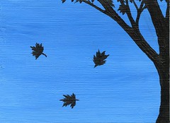
ACEO: Falling Leaves Originally uploaded by diannna-art Acrylic paint on 2 1/2" x 3 1/2", 246# Strathmore Acid Free acrylic paper.
September 22nd, I painted with Primary Blue and Titanium White, blending into a medium blue. (Not too dark.. not too light.) This was one of those many times in which I create a background for the fun of it.. just to feel the brush move paint around.. and not know what will be added later.
Maple trees are one of my favorite types of trees. I love the sound of wind moving through the leaves, the memory of climbing a few, and where ever might settle down.. I hope there will be a maple tree in the yard. While staring out my window on September 23rd, I watched as a few leaves fell to the ground.. and grabbed my notebook to see if I could draw anything closely resembling maple leaves.
Since I thought my thumbnail sketch somewhat resembled maple leaves, I attempted it with paint. I imagined the wind taking hold of a few leaves, making them twist and turn before reaching the ground. This silhouette captures that moment.. that illusion for a little while, leaves can fly.
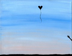
On September 18th, I mixed a Primary Blue and Titanium White to create a vivid blue sky. I looked at the art card for days, trying to figure what I wanted most to be in that sky. I had considered something like an airplane or helicopter.. but the ideas seemed to be more from the head instead of the heart.
When I completed the painting.. 8x10: Arrival, I then knew I wanted to paint another heart shaped balloon. I started to wonder if the balloon was flying away on some adventure or landing after a long flight. Once it took a hold of me.. I decided to not have the ground showing in this silhouette. This balloon is soaring high above the ground merrily enjoying the journey of an adventure in flight.
8x10: Arrival Originally uploaded by diannna-art Acrylic paint on 8"x10" stretched canvas. (From package of Titanium acrylic gesso primed canvases)
The last time I painted on stretched canvas was in March 2010. I have had blank canvases around me for a while, but I have been distracted by my amusement in painting art cards.
On September 19th, I had an idea to paint on stretched canvas. I started to set things up outside.. thinking I would try to paint there and attempt a video of it as well. However, a swarm of mosquitoes caused me to flee indoors. Thankfully, I had doodled a quick thumbnail sketch of my idea earlier that day.. so I could return to it another time.
On September 20th I painted the background near an open window. I used a little Primary Blue, a lot of Titanium White and along the bottom is Light Portrait Pink. The video of the background being painted can be seen on YouTube. (Check out the Video: Painting a Background on September 20, 2010 post in my Art Diary.)
September 21st, I added the silhouette with Mars Black. I had set up my new mini tripod to video the painting.. however mid-way during the process the next door neighbor yelled quite a bit. Due to this, I stopped videoing and tried to just focus on doing my very best to paint that hand on the side of the painting. I was very excited about the concept of this painting and did not let failing the video attempt discourage me.
I wanted it to look like the balloon was just released... but really it is returning. The concept is: Sometimes when it looks like Love is flying away, it is actually landing. It is an arrival, not a departure. The idea of balloons arriving instead of flying away came from a small adventure I had in July 2010. (Curious about the July adventure? Read about it here: Balloon Adventurers)
Usually I do not post my doodles on my Art Diary. (They just hang about on my Flickr.) However, since I had so much fun doodling this one (it was and excuse for me to test my new mini tripod) ..I wanted to share the 31-second time lapse video.
I placed the mini tripod on the edge of my desk, a small flashlight diagonally behind the blank art card and then I tried to ignore the camera was there as I played with the different pens on my desk.
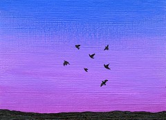
ACEO: Seven Birds Originally uploaded by diannna-art Acrylic paint on 2 1/2" x 3 1/2", 246# Strathmore Acid Free acrylic paper.
On September 17th I blended Primary Blue, Brilliant Purple and Quinacridone Magenta into each other for a background. I ended up liking how it turned out and decided to give myself a few days to decide if it was finished or not.
On September 20th a simple minimalistic image came to mind and I thought it would be perfect for this background. I did not want to have a large silhouette that would block the background. Thus, I kept the ground very low and made the flying birds as small as my hand and brush would allow.
There have been many times when I have seen birds in flight and tried to photograph them. Only a few times has it actually worked. (Camera focus, birds lingered long enough, etc.) To be able to paint what I wish my camera could capture more often, was quite a delight.
Work in progress.. This video is just the background being painted for a future silhouette.
Transcription: Hey there. I am going to work on the background of a painting today. I have a bar stool, ceramic tile, a towel I've already beaten up in the past. ..Thumbnail sketch to inspire me.. remind me of what I am working on.. And an eight by ten canvas. I had tried to paint outside and got attacked by some mosquitoes. So.. I moved things indoors, by an open window. Just mixing some blue and white. This stage I'm not really worrying about the exact color. I like to cover the canvas.. even if I am painting with white.. Just like to cover all that waffle-y bit of the uh original canvas. I don't mind the texture coming through, Just want to cover all that white. Makes me feel like I accomplished something. [Loud sigh] Every once in a while I get a piece of solid paint in there. So I try taking it out with tweezers or edge of a card or paper. I'm a little neurotic about details. Gonna throw a little white in. Ah, and I hear some banging outside. The weather is cool enough for some construction today. [Short, squeaky giggle] Painting around the edges.. Doesn't look like much right now, but.. I always have a really messy phase where looks like I don't know where I'm going. Some days I don't, but today I know exactly what I want. Ok, I feel that I covered the canvas really well. Just going to rotate and check the edges. Yay! Ok.. Just want to lighten it up a bit more. I want a sky that looks really cheery. Not too icy. My favorite days are cool days where it's not too hot, not too cold.. You look up into the sky and there's that hint of blue.. But it's not too overwhelming. That's what I have in mind. Ok, so we have that basically.. covered. K. [Barely audiable, Whispered to self, "It's this one."] Sometimes when I don't use a brush for a while.. It feels like it's not as soft so.. I like to play with it for a moment before mixing it with paint. This is Light Portrait Pink. I think it's a romantic color. And since the notion I have in my head is a bit romantic.. I wanted to put this color in. Looks like it's not blending exactly according to plan.. That's OK. I'll make it work. Looks a bit rough right now. Um.. a thin brush. I keep hitting the tripod. [Sigh] I won't be able to do that.* Taking off some excess paint off the sides. [Singsong] And blend blend blend blend blend. I think this brush is too small.** [Fustrated sigh] Tripod..is..annoying me. [Short, self-depricating laugh] [sigh] Ok..Thankfully** I have a brush with a shorter handle. This is a bronzing blush.. bronzing BRUSH. It's more for cosmetics instead of paint.. [Singsong] But that's not how I use it. I never really use a bronzer. Blush? Sure. But I have seperate brushes for my face. [Sound of a saw] Hmm.. more construction outside. Trying to make that pink kind of wisp upwards. And, flipping it over.. So I have a similiar texture up top. So at this stage it might not look like much.. But.. after it dries. It will be perfect for a background And I'll add the silhouette a little later or tomorrow. Sometimes I like to use a fan brush to correct little areas.. It's probably not how you are supposed to use it at all.. But I like how thin it is and it gently pushes at the paint Or.. this angle it's more of a pulling. And that's it for now. Sooner or later it will be something more. Ok, Bye for now.
* 'that' meaning use the left hand the want I wanted to. ** 'too small' the brush was causing grooves in the paint and I had to be more careful.
I have been painting for over two years, but had not made a video of me painting in real time until creating this one. This video is of me painting (rather rushed) a bunny silhouette. It was my first time trying to paint a bunny at all. I believe this is the fastest I ever painted. I was very aware that the camera was recording and did not want the video to be too long.
Transcription: I think it's more fun watching the colors mix on the canvas itself. Makes the inner child do a little happy dance. Pretty much coated. I don't like any of the canvas showing through.. I don't mind the texture. I just don't like the.. white of the canvas. I guess it's a.. habit now, to try to hide every little square. It's like a minute little waffle. Ok, the horizon will be somewhere around there. (To the paint clinging to the tube) Let go. I like to make it curve along the edges and paint on the outside. This way if I hang it on the wall, look it from a different angle.. it's still going on. ..Be one of those things that no one really notices, but it amuses me. That's pretty much how I do a really simple sky. Looks like a windy day. Think I'll add a slight touch of purple*, just for fun. Probably hardly anyone will notice that later, (chuckle) but I like it. So this is.. Mars Black. It's pretty thick. I'll have to get a new one soon. ..Get another brush. When I was little I used to watch Bob Ross on public television. Can't paint anything like and I don't have any fun commentary like him. But, every once in a while I paint a tree and I think, 'Happy little tree!' Today I guess it's a happy little silhouette. Though it's dark because it's a silhouette, I think it'll be happy. It's an eight by ten canvas and I like holding it underneath. Knowing my luck, I'm probably breaking some rule about how you're supposed to paint. Probably line of sight or something. But, I'm still at a stage where I'm painting for myself, for fun. Some of my family and friends are amused by it. Which, is bonus. It's nice. I like a really sharp edge. Can't always get it to happen. But that doesn't stop me from trying. Really is thick black paint. I guess I've had it too long. And right here. Well, I have a certain holiday on my brain. That should become obvious. Try not to waste paint, I'm grabbing it from the other brush. (chuckle) My first attempt at painting a bunny. Drew one on a piece of paper nearby. Proof that my animal drawing skills aren't that grand. But cute in my mind, sure. Bunny tail. (chuckle) It's looking totally out of proportion. But when it comes to painting, I guess sometimes you do better than other times. Trying to make this a little darker. He's looking up. Little bit of the nose. Kinda looks like a chocolate bunny more than a real one. (loud exhale, chuckle) Gotta pick up some paint here and darken it up. I like to do finer details with my left hand sometimes. Easier that way. I like the little bit of light showing through, the paws. (sigh) Hmm. Looked like he hurt a paw. And.. I'll have to try it again sometime. Maybe paint over this one. Bunny! That's a problem**
*Dioxazine Purple **Refers to trying to put the painting down while all the edges are wet.
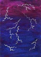
ACEO: White Lightning Originally uploaded by diannna-art Acrylic paint on 2 1/2" x 3 1/2", 246# Strathmore Acid Free acrylic paper.
On September 17th, I blended Primary Blue and Quinacridone Magenta with much less blue toward the top. It turned out to be very dark and I left it to dry, thinking I would paint over it the next day.
I did not paint over the dark background the next day. Instead, when I looked at it.. I thought it offered the perfect opportunity to attempt to paint lightning. I never tried to paint lightning before, but I tried to recall what flashes of lightning looked like and then recorded what came to mind with Titanium White paint.
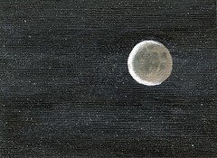
ACEO: Waning Crescent Originally uploaded by diannna-art Acrylic paint on 2 1/2" x 3 1/2", 246# Strathmore Acid Free acrylic paper.
In the past, I painted a Waxing Gibbous and decided I wanted to revisit the idea. This time I would switch which part was light with the part was dark.. turning a Waxing Gibbous into a Waning Crescent moon.
On September 15th, I covered the art card with Mars Black and let it sit overnight to dry thoroughly. The next day, I put Titanium White on a toothbrush put aside just for painting. (I realized I did not have a toothbrush for this in NY yet, and my Mother gave me a spare to add to my NY brush collection. Thanks Mom!) Just like in elementary school.. I used the pad of my finger to brush at the bristles and star-like splatters formed.
In some areas, I went over the stars with Mars Black and splattered over it again, causing a variety in the density of the stars in the sky. Once the card was dry, I placed a US penny on the art card to help determine a location before painting a circle with Burnt Umber. Burnt Umber was mixed with Titanium White to create different shades while I worked on the dim side of the moon. The dim side is the part that catches my curiosity and made me want to work all the more carefully on those details. The Crescent was painted with Titanium White over a portion of the moon, making it the brightest section.
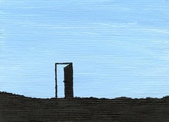
ACEO: Just A Door Originally uploaded by diannna-art Acrylic paint on 2 1/2" x 3 1/2", 246# Strathmore Acid Free acrylic paper.
The sky was painted September 14th with a hint of Primary Blue in a lot of Titanium White. I left it to dry completely overnight.. knowing I wanted to create a silhouette, but not sure what that silhouette would be.
The next day I painted the ground with Mars Black, making the horizon line rough to indicate grass. Then I left that to dry. I suddenly had the idea of what I would add.. but I had to take time to doodle out a thumbnail sketch. I never painted a door like this before. Once I had chosen how the door would open and look, I painted it in Mars Black as well.
I knew the title but not how I would spell it. Just Adore or Just A Door. I went with the literal spelling but feel when the title is pronounced instead of seen.. it is both an observation and instruction. If you can see it as a door to possibilities and a door to love.. you decide if it is just a door of if you should just adore.
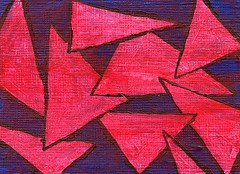
ACEO: Triangles In Red Originally uploaded by diannna-art Acrylic paint on 2 1/2" x 3 1/2", 246# Strathmore Acid Free acrylic paper.
I started this on September 10th and took my time deciding each step of the way.
At first, the art card was covered in Primary Blue and left alone. I looked at it the next day and did nothing to it. On the 12th, I decided to make some triangles with Titanium White. A day passed and again I did nothing. Then, on the 14th I outlined the triangles with rough lines made with Mars Black. I knew it was not complete, but did nothing more until the 15th. I added a thin coat of Primary Red over the entire piece.
It is difficult to see where blue touches black under the red because of how dark it is. I find the simplistic shapes overlapping pleasing as I move my eyes from right-to-left and jarring as I move them back left-to-right. I am glad I did not rush this piece and feel it reached a happy conclusion.
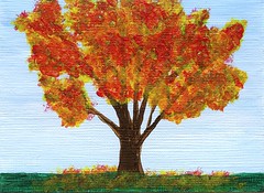
ACEO: Autumn Tree Originally uploaded by diannna-art Acrylic paint on 2 1/2" x 3 1/2", 246# Strathmore Acid Free acrylic paper.
The leaves on the trees around here are still green, but the past few comfortably chilly nights have made me anticipate the coming change of seasons.
The sky is mostly Titanium White and just a hint of Primary Blue. I wanted the blue to look almost washed out, making the sky be a foreshadowing of Winter. Burnt Umber forms the tree branches. The leaves are made of Primary Red and Primary Yellow dancing over a thin amount of Phthalocyanine Green. All three colors are used on the ground to form grass and fallen leaves.
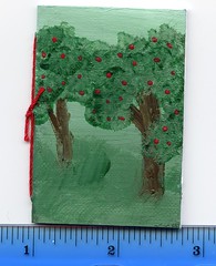
(The ruler under the minibook image is showing the measurement in inches)
Since I started using Strathmore paper for my art cards, I have been trying to think of what to do with my other unused art card blanks. I have some cardstock, acrylic paper, canvas paper and folder paper already cut to ACEO size and did not want to let it collect dust.
I decided to fold it in half, add five pieces of printer paper.. and used some old thread to bind it into a minibook. I poked holes in the acrylic paper before painting on it and this choice made things much easier to assemble once the paint was dry.
It was more fun to create than I had expected. Thus, intend to create a few more in the future. Some with blank covers and some painted.
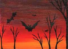
ACEO: Bats In Flight Originally uploaded by diannna-art Acrylic paint on 2 1/2" x 3 1/2", 246# Strathmore Acid Free acrylic paper.
Halloween is next month and it is a holiday I enjoy. Thus, it has been on my mind and a Halloween sort of image made its way onto another of my art cards.
The day before.. I doodled some bats to see try to figure out how best to attempt to paint them. Then, I did a quick thumbnail sketch. After I knew what I had planned.. I set to painting the background. I wanted it to go from orange to dark purple. I mixed Primary Yellow with Primary Red for the orange and then blending upward with more red and finally mixed a little Primary Blue to create a dark purple. It was then left to dry for the night.
I had intended to paint the tops of a few trees and then place the bats in last. However, when I sat down with the Mars Black paint, I painted the bats first. I later found this worked in my favor as I was able to bend the tree limbs to point toward the bats and interact with them a bit more. It was a lot of fun to paint Halloween bats in flight.
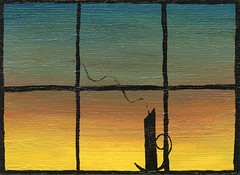
I doodle windows and candles often, but due to being intimidated by having to attempt to draw straight lines.. I have not attempted to paint a window until now.
I painted the background the day before blending upward with Primary Yellow, Primary Red and Primary Blue. The red and the blue were much darker than I planned.. so I threw in a bit of Titanium White to make it easier to see the planned silhouette. I blended for quite a while and worried it would become too muddy. Finally to remove some deeper valleys created by my brush strokes, I swept the surface from yellow up to the blue with a cosmetics brush (blush brush) I use only for my acrylic paints. It created a slightly wood-grain-like look that I was pleased with.. so I left it alone to dry for a few hours.
Later, I returned with Mars Black and painted the window frame. At first, I tried to keep things much thinner.. but it kept growing as I had difficulty making the lines look uniform. I accidentally smudged the paint many times and had to go back to correct my mistakes. But, there finally came a time when it looked like a window and I left it to dry for the night.
I had thought that painting the handle of the candle holder was going to be more difficult than it was.. but by turning the art card and moving slowly, it worked out. I planned on having the candle unlit but waited until everything else was dry before attempting the wisp of smoke.
With the wisp of smoke, I tried a bit of white and it looked too bright. Gray looked too out of place.. and I worried that black might look too dark to look like smoke. However, after many attempts the paint started to dry and become difficult to use. The paint became increasingly difficult to get onto the art card. Just before I was prepared to put more black paint on my tray I gave it one last try. The paint only partially went on the art card as I moved my thin brush.. and it produced a rather wispy result. Usually when this occurs, I paint over the line once more to thicken the appearance. In this case, it was perfect just the way it was.. making the candle look as if it was just extinguished.
I feel that it is a sleepy sunset. One can imagine someone blowing out the candle, putting aside a book they were reading and preparing for sleep.
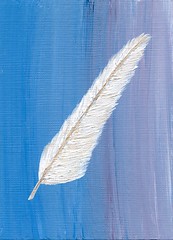
ACEO: Waiting To Write Originally uploaded by diannna-art Acrylic paint on 2 1/2" x 3 1/2", 246# Strathmore Acid Free acrylic paper.
I created the background on September 7th with the intention of returning to add a silhouette. However when a friend visited and suggested that I attempted to paint a feather.. this art card was suddenly destined to go in another direction..
On September 8th, I painted the center line of the feather with Titanium White and then let it sit for the day.
September 9th I returned to the art card and formed the rest of the feather with Titanium White and a tiny amount of Burnt Umber to highlight the center of the feather and add a little more detail to the fluffy part.
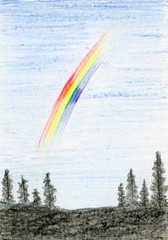
Usually I do not pose my doodles on my Art Diary, but I had too much fun with this one to not talk about it. I was given some fun art supplies for my birthday, including Crayola Colored Pencils. I had to play with them and see what might happen.
I tried to create a silhouette of trees along the bottom while forming a rainbow in the sky. Outside of the rainbow, the sky is made up of three shades of blue blending into each other. The rainbow is made of pencils marked: Red, Orange, Yellow, Green, Blue and Violet (Purple).. so other than indigo, I completed the traditional ROY G BIV.
ACEO: Stormy Night Originally uploaded by diannna-art Acrylic paint on 2 1/2" x 3 1/2", 246# Strathmore Acid Free acrylic paper.
I have been wishing for more rain lately. I miss the sound against my windowsill. I miss the way it makes everything grow. The way it makes everything look cleaner for a little while. And, I have found myself daydreaming about my craving for rain.
I tried to imagine the most turbulent sky, the most intense tempest.. and then I put paint on my blank art card until I felt I created a stormy night, starting just at the very end of sunset. I imagine if the sky looked like this, it would be very rainy, windy and there would be a threat of a possible tornado.
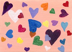
Although it might look like an attempt to paint heart-shaped confetti.. it is actually a visual love poem. There are no words. Love is sometimes pure as fresh snow and other times as passionate as fire. Being in love can make one blue when far from their loved one(s). It could be joyous and make the lover feel like they could fly. It can bring out our dark sides.. our light sides and sides of ourselves we never knew. Love goes beyond words and that is why this is my love poem without words.
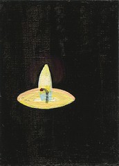
First I covered the blank art card with Mars Black and let it dry completely. Then I returned with Titanium White and created the shape of the candle and flame. I had to wait for that to dry before continuing. Then I used Titanium White and some Primary Yellow. A tiny hint of Quinacridone Magenta to add some shading to the melted candle wax. Finally a hint of Primary Blue was mixed with white to get the flame-core blue. A touch of magenta was put on the end of the blackened wick and then brushed in the black near the candle flame to break up the darkness just a little.
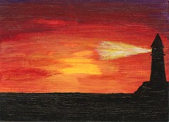
This painting is a combination of thoughts in my head from the past few days. First.. being from Long Island, New York.. when there was concern about a hurricane.. there was mention of Montauk Point on the news. Maybe I was brought there as a small child, but I have no memory of Montauk Point. All I have is what my imagination draws in my mind.. a lighthouse on the very end of Long Island.
The second is the cliche, "Red sky at night, sailor's delight" I have heard this my entire life. Even though I am not a sailor, I think of that cliche every time I see a very red sunset.
Montauk Point is on the East end of Long Island.. so painting a sunset inspired by what my imagination thinks of it.. creates a situation that would not a occur. The end of Long Island is the place to go view the sunrise over the water. This is not really Montauk Point.. but it is a lighthouse and it is during sunset.
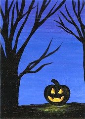
September has only just begun, but already Halloween keeps coming to mind. I love Halloween.. especially carving pumpkins. A relatively new tradition of mine is carving pumpkin pie as if it was going to be a Jack O'Lantern, and then eating it that night. So the image of a carved pumpkin is key to how I celebrate Halloween.
I never really thought my trees looked spooky, until I painted two near a glowing Jack O'Lantern. The glow from the carved pumpkin breaks my usual silhouette, but was a lot of fun to try. The night sky is a mix of Dioxazine Purple, Primary Blue and a hint of Titanium White to make the horizon a little lighter. The silhouette is Mars Black. The glow from the Jack O'Lantern is a layer of Titanium White with two shades of orange (Cadmium Red Deep Hue and Primary Yellow mixed together)
Yeah.. back in March I painted a Bunny Silhouette on an 8x10 canvas.. but I love bunnies, so I wanted to do it again. This time, as an ACEO and this bunny is a sleepy, unlike the sitting-up, perky Easter looking one I did in March.
There are many wild bunnies in my neighborhood and I always love seeing them. They have fun ears and sometimes they look like they want to take a nap as soon as the sunsets. This bunny is inspired by those I have seen in town and even in my yard.
I began by painting the night sky background on August 30th, let it dry overnight and put the silhouette portion on the day after. The sky is a blend of Dioxazine Purple, Primary Blue and Titanium White. The silhouette is made of Mars Black.
After painting tree swings in black and white while in Las Vegas, NV (one month ago).. I knew I was going to revisit the idea. This time, however, I added someone sitting sideways on a long swing looking up into the vast sky. If I had a tree swing, I doubt I would be able to resist sitting outside during some quiet evenings.
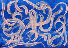
On August 24, 2010, I filled the background of this art card with Primary Blue and then let it sit around for days as I tried to imagine what I might add. I got to the point where I thought I was going to end up painting over it, when suddenly I decided to add Light Portrait Pink.
I played with a long handled brush, drawing curves all throughout the blue void until I felt the piece was complete. With paint, I purposely drew squiggles, numbers, loops and incomplete circles. To me, it looks like ribbons falling through the air.